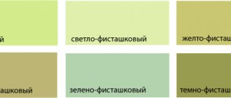
Psychology of pistachio color and its meaning
The first question that a homeowner asks himself when thinking about renovating or initially decorating a new apartment is what color scheme should he use to decorate this or that room? The style of future furniture, the colors of textiles and much more depend on the chosen combination of shades.
In the process of choosing the color scheme for the future interior, many are guided by personal preferences, forgetting that each color has a specific and scientifically proven effect on a person’s psychological background, his mood, appetite and sleep.
In this regard, pistachio is one of the most versatile and beneficial flowers.
People's positive perception of this shade of natural greenery is due to the fact that green color has been associated since primitive times with the warm season, the onset of spring and abundance. In addition to psychological peace, pistachio in the interior has a slight therapeutic effect - in such a room blood pressure is normalized, pulse and breathing are equalized, muscles relax and attention is concentrated.
City residents who suffer from a constant lack of greenery, fresh air and clean nature will especially benefit from the use of this color. Pistachio will help reduce stress levels, add harmony and tranquility to the bustling whirlwind of city life.
The use of pistachio shades in various interior styles
This color is quite often found in the design of modern interior styles: high-tech, minimalism, contemporary. This is due to its successful combination with chrome elements, plastic and gloss.
Large accessories or single pieces of pistachio-colored furniture always look great
The naturalness of green colors fits perfectly into the eco-style that is popular today. If you put an accent on the pistachio shade, it will become a good option for pop art or eclectic style.
Tuscan interior style has Italian roots. Natural wood, all kinds of forged products and green shades are used in large quantities here.
Pistachio upholstery on the wicker chair cushions is just what you need for relaxing on a sun-drenched patio
Pistachio-colored plush pouffe in a colonial-style interior
The French style of Provence is characterized by romanticism and lightness. An abundance of textiles and all kinds of wicker baskets, vases, even pieces of furniture will be an excellent complement to the pistachio color.
The combination of pistachio with floral prints, paintings from nature, and so on, gives the interior a spring freshness
Combination with pistachio color in the interior
Unlike bright, too dark or cold green tones, pistachio is a warm, pastel and fairly neutral shade, so it is quite difficult for them to overload the interior or create an oppressive atmosphere in the room. However, there are several simple rules that should be followed to create the ideal stylistic solution.
- Warm with warm
Pistachio is a warm color, so it needs to be combined with warm pastel shades - light beige, peach, pale pink, yellow, ocher and brown tones. This color also looks good in combination with a pure white tone.
- Natural harmony
It's no secret that the world's leading interior designers often borrow ideas from living nature for inspiration. It’s easiest with green shades - just look at a photo of a forest or flower garden with pistachio-colored foliage, and you can immediately identify the most suitable companion colors for yourself: brown, khaki and ivory.
In this context, natural wooden or wicker furniture, light, beige textiles and flooring will look very beneficial. As an accent to liven up the interior, you can add decorative red or pink little things to transform your home forest into a blooming garden.
- Dominant or assisting?
An interior completely filled with pistachio color will not be sharply repulsive, but it can easily turn out to be boring, so professionals use it either as a background or as an assisting color in textiles or furniture. It’s easy to choose the appropriate option - in a small room with poor lighting, it is better to use only pistachio details, and in large and spacious rooms you can safely paint the walls in this soft shade without fear of losing the sense of space.
What should you absolutely not combine this color with? Clean and bright green tones will make pistachio look dirty, while dark red, blue and purple will destroy the feeling of lightness and freshness.
But there are many examples of a successful combination with deep black color, but such a bold and risky step requires the work of a professional, because the slightest mistake will turn a stylish solution into a real disaster.
How to use in the living room
The purpose of a living room is to be a beautiful, functional place for entertaining guests and to promote not only rest and relaxation, but also active activities.
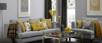
Light green walls successfully set off wrought iron furniture and accessories, including chandeliers and floor lamps. Combined with cheerful orange, pistachio-golden color does not require any frills at all. This is an ideal combination for a minimalist, and most importantly - inexpensive designer environment.
Pistachio color in a classic living room is usually combined with white, emerald, beige, and brown. The same color in a high-tech or fusion living room setting can successfully “play along” with even bright and self-sufficient shades of turquoise, coral, and indigo.
A pistachio sofa in the living room is truly flawless when it has:
- legs of cardinal colors;
- unusual shape of the back;
- classically shaped armrests;
- upholstery using the Capiton technique.
Pistachio color in the kitchen interior
Thanks to its natural softness, pistachio is perfect for decorating cooking and eating areas.
There are a number of kitchen interior design styles that are impossible to imagine without the use of pistachio color.
- Provence, country and classic
In combination with wooden furniture, an abundance of light shades and natural materials, such kitchens look great and, moreover, help improve appetite. Classic kitchens are invariably cozy, and decorating kitchen facades with grilles, carvings and balustrades will add individuality to the interior.
- High tech
This style allows you to combine pistachio color with chrome metal parts, and the glossy facades of modern kitchen sets will not only add color to the interior, but also visually expand the space, reflecting the light falling on them.
In each style, you can choose a successful combination of tones and materials both for a small compact kitchen with low ceilings, and for a spacious kitchen - living room with an extensive dining area.
What colors does it go with?
The pistachio tone is optimally complementary with green and red-brown tones, and also with beige, white, and yellow decoration colors. When using this shade of green, combinations with blue, purple, and pink look bright, even provocative.
The harmony of muted green, gray-brown, and beige allows you to create amazing interiors with the effect of age, dustiness, and historicism. Golden-green colors for the bathroom are good, combined with amber, plum, and cherry.
The delicate pistachio-golden tone can be used to decorate any room. In this case, the walls and ceiling can be painted in different colors. You just have to remember that pistachio somewhat pollutes and darkens cool light shades. This is especially noticeable on cardinal white.
The ideal combination of pistachio color with other colors can be found using real palettes of photographs you like from glossy magazines and the Internet.
Pistachio color in the living room interior
Today, Scandinavian-style interiors are becoming increasingly popular, in which pistachio shades are combined with crisp white wide baseboards, window and door frames, and light and light textiles. Such a living room is filled with light and freshness, the space breathes and pacifies with its lightness.
For those who prefer a classic style with an abundance of dark wooden furniture, the pistachio color of the walls and curtains will help balance the heavy filling of the room. When choosing such a solution, do not forget that dark furniture is appropriate only in spacious rooms with fairly high ceilings.
It is best to decorate a small living room in white or light beige, refreshing the interior with pistachio elements in the form of a small carpet, window or furniture textiles and accessories. These accents will be enough to create a fresh and cozy atmosphere in the room. To create a more playful and modern design for this living room, you can add some bright yellow, blue, turquoise or orange elements. The abundance of light color in the background allows you to focus attention on several contrasting shades at once.
Another good solution is the use of floral patterns. One of the walls or some part of it, furniture upholstery or curtain fabric with a pistachio print can enliven the interior and become a decoration of the living room, provided that most of the other interior elements are monochromatic.
Natural materials
Lovers of naturalness highly value muted green interior backgrounds. They are ideal for placing:
- wooden, bamboo panels;
- stone;
- leather, fur;
- jute, rattan, cork coverings;
- reed, reed fabric.
Olive and pistachio colors perfectly complement natural wallpapers, plasters, sisal, siagrass, and coconut fiber coatings. Combinations of walls painted in a golden-green shade and floral wallpaper made from arrowroot, nettle, and golden flower look beautiful.
To decorate a bathroom with natural materials, use pistachio-golden or olive-colored ceramic tiles. Against its background, bathtubs, sinks, and functional furniture made of oak, teak, and cypress wood are placed.
In the kitchen you can successfully “play” with white. Against the background of a golden-green hue, it will look aged. If you use brown or gray natural cladding, as well as furniture and accessories decorated in Provence style, you will get a charming country corner.
Pistachio color in the bedroom interior
The choice of color scheme for the sleeping area must be approached with special care, because an unsuccessful combination can turn the bedroom from a rest room into a room of nightmares.
Choosing a color scheme in favor of pistachio will definitely be successful due to the calming and relaxing properties of this color.
It is pistachio and combinations with it that professional designers will most often recommend when it comes to the interior of a children's bedroom - kids are the most sensitive to their environment and warm green is one of the guaranteed safe shades.
If the owner wants an enveloping and deep atmosphere in the bedroom, you can use different shades of pistachio for walls, furniture and textiles, turning the room into a kind of cozy color cocoon.
And to create a bright and fresh bedroom, you need to create a light background using pistachio curtains, bedspreads and furniture covers.
Either way, gazing at the warm green hue before bed is one of the best ways to calm yourself, relieve stress, and set yourself up for a peaceful night's rest.
Application in the interior
What is good about pistachio color is its uniqueness. It changes little depending on the lighting, it has few shades, and this makes it very predictable in the interior. There are very few interiors completely made in this color for obvious reasons. This color is most often used in accents and accessories.
Pistachio color is well suited for a children's room, a living room, and a bedroom. The rich color goes well with white, yellow, red, pink, and peach. Pistachio accessories refresh the interior well. The color matches all classic colors - white, cream, café au lait, olive. Small accents in red and pistachio colors (pillows and lampshades) make the picture more energetic.
Let's immediately see what not to combine pistachio accents with in airy and bright interiors in a classic spirit. The interior of the bedroom in the photo below is dominated by white and creme brulee colors, which are successfully complemented by a bright accent. But a lamp with a marsh-colored lampshade looks like a dark and rough spot in an airy interior.
The bright summer pistachio color generally does not conflict with the muted autumn colors, which include the marsh color. But in a light interior with a bright accent, dark-colored accessories are visually discordant if placed above floor level. In other words, a dark carpet - yes, a dark lamp - no. Pistachio and white colors can be “swapped” - pistachio can be the main color, and white can be the accent color.
Please note that vertical white accents give the interior exceptional harmony and freshness. This is a very good solution for rooms with low ceilings. And to prevent the “pistachio + white” combination from looking too sterile, add warm cream, orange, peach, clover-pink, yellow, and coral accents.
Pistachio color in the interior of the hallway
When choosing the interior of a hallway, the most important thing is to take into account its size and lighting. Using a rich pistachio color for the walls of a tiny room can turn the hallway into a cramped and uncomfortable box.
Designers solve this problem with the help of mirrored wardrobe doors or glossy surfaces of walls and ceilings. In the hallway, playing with light and space is often the only way out.
When used correctly, pistachio color in the entrance area can become a welcoming invitation and part of the cozy atmosphere of the home.
Combinations with materials and other colors
Pistachio color goes well with natural materials - wood, stone, straw, bamboo, etc. . Therefore, it can be safely combined with colors of the autumn and sweet palette. If your interior is in warm beige, vanilla, caramel and coffee-with-milk colors, you can safely use pistachio accessories. The same applies to interiors in autumn colors - gray, tan, brick red, gray-green, etc.
In the interior in autumn colors in the photo, everything is well chosen, except for the black sofa. The ecological minimalism style in which this living room is designed does not use black.
Pistachio color combines interestingly with deep colors - wine red, sea green, emerald, blue, violet. The photo above shows a very unusual fusion living room interior with an interesting play of colors. The background is gray-beige and brown from the autumn palette, large accessories are dark rich purple and sapphire blue from a deep palette, and pistachio accessories refresh the interior and make it less serious. In videos about tricks they sometimes write “do not repeat! dangerous!" - so is this photo. Only a true master of design can combine three such different palettes in one interior.
Blue and blue tones
Pistachio generally goes well with blue and turquoise tones from different palettes. And deep, as we just saw, and watery. Rich iridescent blue color goes well with pistachio.
Pistachio color goes well with blue and in a pastel version. The combination of pistachio and sea green looks very interesting.
But as for the blue color, it seems that it does not go with it as well as with blue, turquoise and sea green. The blue color to be combined with pistachio should be bright and lively and in no case muted.
I found a photo of an interior that, in my opinion, used the wrong blue. And I processed it in Photoshop to an acceptable result. (Again, in my opinion) The photo on the left is the original version. Muted blue next to cheerful pistachio looks faded. The photo on the right is after processing. Rich bright blue goes better with pistachio.
Orange
One of the best combinations of pistachio color is with orange. This is a win-win option if you want a bright and energetic interior. Therefore, a lot of furniture for the bathroom, kitchen and children's room is produced in a combination of orange and pistachio. All those rooms that require a charge of vivacity and good mood.
Other green colors and shades
Many people wonder whether pistachio color goes well with other green colors. Why not, it goes very well (photo above). However, please note that in order for the combination to look good, these colors should be accent colors and not background colors. It is very important. If green, especially bright, is the background color, then pistachio cannot compete with it and looks alien.
The green color in the photo above is the background color in the interior. As a result, in the photo on the left, the accent looks too bright against the washed out green background. In the photo on the right it’s the other way around – he’s paler and looks somehow pitiful.
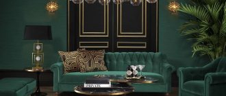
Black
In addition to the classic solutions “white + another color + pistachio”, you can also consider more spectacular ones - when pistachio color is combined with black. Personally, I don't really like them, but it's a matter of taste. If you like modern, eye-catching solutions, then “black + pistachio” might be right for you. The extravagant interior in the photo is based on a black and white solution. And color is used for accents.
Let's immediately see how not to combine pistachio color with black. The pistachio panels in the photo above look meaningless without other accessories of the same color. It’s as if there wasn’t enough black material and the first one they came across was stuck on instead. Another photo tries to place a simple and cheerful color in an uncharacteristic context. Exquisite bonsai, aged wood flooring, something anthracite shimmering in the background.
Pistachio-colored walls (wallpaper or paint)
To create a classic or Scandinavian style, the use of pistachio color in wall decoration is a popular and extremely successful solution. Photos of finished interiors with pistachio walls are filled with warmth and comfort. But the harmonious use of this shade as a background requires adherence to certain artistic rules.
- Plain coating
In order for a plain pistachio background to look fresh and not absorb light, it is necessary to shade it with light elements - furniture, flooring or window textiles. Even if a classic interior involves furniture in dark shades, you must definitely allow light into the room with the help of some light accessories or details.
Regardless of the wall covering material, be it liquid or simple wallpaper, paint or panels, plain coloring allows you to use pistachio even in small rooms without the risk of overloading the space.
- Covering with a pattern
Unlike plain walls, patterned wallpaper is more demanding on the size of the room and the location of light sources. This coating weighs down and visually reduces the space, so it is appropriate to use only in spacious and bright rooms.
Another rule is that there should not be too much pattern; when using any print on the walls, it is preferable to use plain furniture and other textiles.
- Photo wallpaper
Since pistachio is a natural color, it is often used in modern interiors as a leading tone in photo wallpaper designs. Most often, such a pattern decorates only one wall in the room, and its richness is softened by the neutral shade of the remaining walls. The most important thing when using such a canvas is not to clutter the finished pattern with furniture, allowing it to lead the room, decorating and refreshing it.
Bedroom
Today, using light green shades to decorate a bedroom is considered good form. They have a calming effect and help you fall asleep quickly. Pistachio color in the bedroom is usually combined with white, beige, black, and sometimes shades of dark chocolate are added.
The monochrome walls of the bedroom are diluted with patterned headboards in cardinal colors and non-woven frescoes.
Floral prints on the walls imply the presence of decor in the form of rosettes, friezes, pilasters. To add a refined touch of antiquity, figurines and table lamps with ceramic legs would be useful.
An excellent companion for golden-green bedroom walls is photo wallpaper with macro photography of plants.
The combination of pistachio and purple in the bedroom interior is considered classic. These colors can be used to paint not only walls and ceilings, but also to tint furniture, floors, and decorative items.
Pistachio curtains
Pistachio-colored window textiles are used both as a solitary accent in light, neutral interiors, and as a companion to other elements of the room of the same shade.
Pistachio color in window decoration fills the room with summer freshness, warmth and can improve your mood even if there is a gray and dank autumn cityscape outside the windows.
The versatility of this color allows you to combine light tulle with green curtains, pistachio tulle with beige curtains, plain and patterned fabrics.
Pistachio curtains are the most popular classic solution, because they create coziness both in a room with wooden furniture and in a pastel interior in light colors.
Modern design often uses pistachio-colored blinds and roller blinds - this solution increases the usable space of the room and helps hide insufficient ceiling heights. Curtains with pistachio stripes are also a great way to visually increase the height of the room and add volume to the room.
In the children's room
To decorate a nursery, it is allowed to use the most flashy, most cheerful shades of the color spectrum. However, it should be remembered that a room that is too bright will irritate and tire the child.
What color goes with pistachio in a nursery? Optimal companions:
- pink, beige;
- yellow, white;
- purple, black;
- gray, crimson.
Near the walls of a children's room in a light green shade, you can install furniture with facades in the indicated shades. Volumetric interior decals and stickers will help you get away from boredom.
A pattern of wide multi-colored stripes looks very cute, even extravagant, on the walls of a nursery. The main tone for girls, in addition to pistachio, can be pink. For boys, it is better to alternate wide light green stripes with black ones.
Scientists have proven that the tones of the green spectrum have a calming effect on babies, normalize breathing and heartbeat parameters, and improve vision.